
Change Colors
Change the color of visual items such as metrics, trend lines, dimension members, and data points.
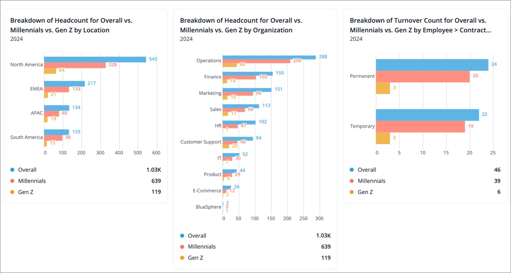
If your analysis contains multiple visualizations, it is best practice to use a consistent color to represent the same visual item across all visuals. For example, have the color pink represent the Millennials dimension member and the color yellow represent the Gen Z dimension member across all visuals in your analysis. This makes it easier for viewers to follow your data story and helps avoid confusion.
When creating visuals, you can set specific colors for visual items such as metrics, trend lines, dimension members, and data points.
Note:
-
The order of colors in the palette dictate the color that is used for visual items as more items and values are added.
-
If a visual item is not assigned a specific color (automatic is selected), the platform will try to select a color from the palette that has yet to be assigned to another visual item.
-
Assigned colors will not carry over to other dimension levels. Users will see different colors when they drill up and down in the visual.
-
Admins can create custom color palettes for you to use. For instructions, see Create a Custom Color Palette.
Change colors in Explore or full screen
Change the color of visual items when building visuals in the Explore room or full screen.
-
Click the Change colors button
 on the Visual Actions menu.
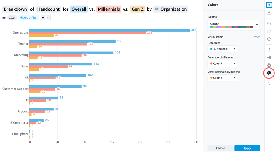
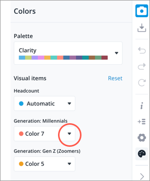
- In the Colors panel, select a color palette.
-
Assign a color to your visual items by changing the selection from automatic to a specific color.
- When finished, click Apply.
- Optional: Capture the visual, so you can quickly add it to your analysis with the assigned colors.
Change colors in an analysis
Change the color of visual items within chart cards that you've added to your analysis.
- Click the chart card you want to edit.
-
Click the Change colors button
on the Visual Actions menu.
- In the Colors panel, select a color palette.
-
Assign a color to your visual items by changing the selection from automatic to a specific color.
- When finished, click Apply.
- When finished editing the chart card, click Save and Close in the upper-right corner.
- Repeat steps 1 to 6 for each chart card that contains the same visual item. Assigned colors do not sync across charts in an analysis.
Supported visuals
The following table shows the visual types and visual items you can change colors for:
|
Visual Type |
Visual Items |
|---|---|
|
Breakdown |
Group by members, comparisons, difference |
|
Trend |
Group by members, comparisons |
|
Trend Breakdown |
Group by members, comparisons, difference |
|
Bubble Grid |
Positive and negative values |
|
Movement Breakdown |
Positive and negative values that contribute to the net change of a metric |
|
Movement Summary |
Movement metrics including moves in, moves out, and net change |
|
Quadrant |
Positive and negative values for the third metric, secondary group by members, primary group by |
|
Relationship |
Positive and negative values for the third metric, secondary group by members, primary group by |
|
Drivers |
Groups that increase (positive) and groups that decrease (negative) the metric |
|
Contribution |
Group by members |
|
Collaboration Circle |
Positive and negative values for nodes and links |
|
Pipeline Flow |
Primary color |
|
Pipeline Trend |
Primary color and highlight |
|
Pipeline Funnel |
Primary color and highlight |
|
Distribution |
Primary color, comparisons |
|
History |
Primary color |